Sixteen - Order is restored

Yesterday sixteen took us close to the edge, a photograph of a coffee drinker, drinking tea from a Starbucks mug - so many things wrong with that photograph (not to mention the 16mm lens being used for a portrait! bend+stretch) 

This little journey of single camera+lens combo is making me think in stories already, the guy started in his office, where he spends a lot of time, took him on a wander around his neighbourhood to "the walled city" then back into the office for a late night tea drinking session... Today we're exposing, slowly, coffee and a quick customer service session before heading out to mess about in the mostly rainy backyard with the kids... We might try break some more concrete - who knows?

Sixteen : Day Four | Thursday September 18th, 2016

What? Oh, it's just a project inspired by a bloke named Peter from ProTog, a great camera shop here in Melbourne. I use one camera / lens (I've chosen the a7rMk2 and the 16-35mm at 16mm) 

I've chosen to use any type of lighting and I'm trying to build all of the images into a sequence with a story. 

Enough for now. 

Sixteen - Don't do this

This? Shoot a portrait with a really wide lens... Unless you're going for weird distorted facial features. 

Sixteen : Day Three | Thursday September 17th, 2016

A coffee drinker, drinking tea, out of a Starbucks mug - What else could go wrong?

Sixteen - The walled city

The development down the street was supposed to be well and truly complete by now, by last year... It's still a big old block of empty mud. The 12' high black fence that runs the length of a block on all sides is testament to over-supply of expensive apartments. 

Sixteen : Day Two | Thursday September 16th, 2016

Sixteen - The bag guy

I was speaking to a bloke today about photography. He challenged me to choose a camera, focal length and to take a photo a day for a month. Not only self portraits, but any photo, daily surroundings but push the boundaries. 

I choose 16mm and my Sony a7R Mk2

This is the start of that journey, just because it's late and I'm not going outside in the rain. 

Sixteen : Day One | Thursday September 15th, 2016


Centering thumbnails in SquareSpace

A quick look how to best place your images in your SquareSPace website. Using a 3x3 gallery with a particular crop, in this case 1x1 / square, you need to be able to choose the viewable area of your cropped thumb to make the most impact - the video shows you how to adjust your images, it'd dead easy - drag the little circle to where you think is best, click apply, relax. Hi Ted!

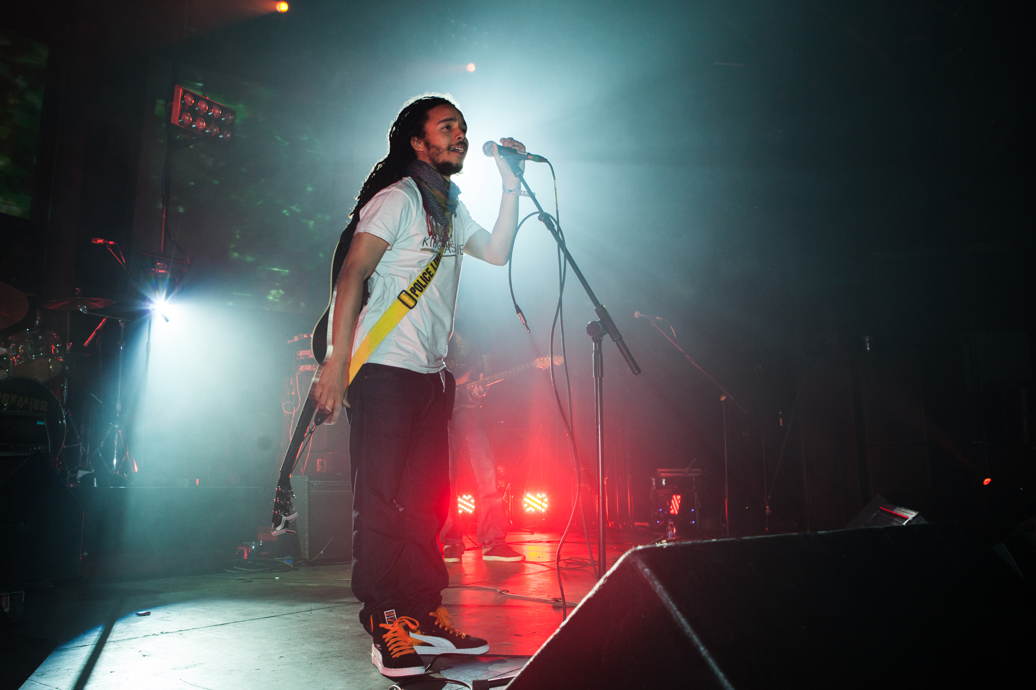
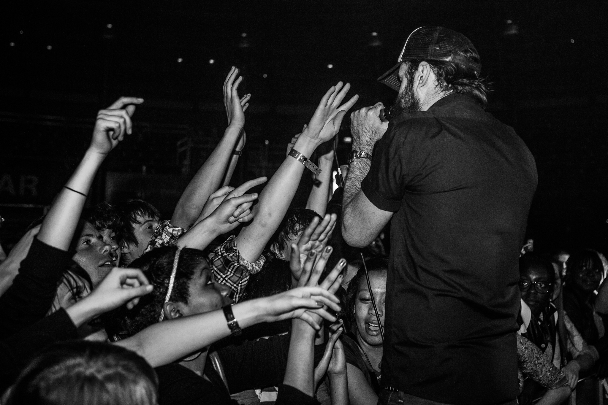
2009 - Old gig I photographed, http://www.noisettes.co.uk/ || #Noisettes #BringTheNoise #MakeContact